I know this is all week old news but a cople days ago a wrote this entire post already and then it got deleted before I could publlish and I just really didnt feel like writing it again but here we go anyway.
First of all I made a cartoon for Pico Day called Darnell for President and I mean it's right there you can just watch it.
This is the first time I ever made anything for Pico Day. I've always wanted to but I never felt like doing some generic action gun fight, although I guess everyones kinda done with those nowadays it seems like so that's good. Anyway I basically just did the same thing I always do which is just two characters standing there talking. It's tough cause I really like that setup, it's the easist and most effective way to write for me and I feel like there's an infinite amount of things you can say with it. But at the same time it feels like it's been getting really formulaic. I've kinda felt that way for about a year now and you can see that I tried to mix it up a little with my NATA entries. With Door to Door the characters walk around while their talking and in Oooga Booga Boys and Lost Track there's more than two characters, but they're all enssentially the same formula with very very minor changes. This time I wanted to build off of it and actually have something happen after the big talk scene is done. I guess "the thing that happens" just ended up doing more 2 character dialogue, but for some reason this time it feels different than in past. Maybe it's because the story takes place over 2 days or maybe I've fooled myself I don't know. I'm defintely going to try and push my boundires cause I don't want to get stuck in a rut and keep pushing out the same shit. Just the other day my good pal Bill Premo said he could see me pulling off a series. That was really cool to hear cause Bill has good taste in cartoons and because in the back of my mind that's something I've always wanted to do. And if you really want to dig back into my old stuff you'll see that I did attempt it but I realized how bad it was a few episodes in and quickly ended it. It left a bad taste in my mouth about every internet series. They all seemed kinda pointless and they always came off as though they were the creator's child that they had to show eveyone pictures of but no one really cared, or at least I didn't. There were always the rare few though, like Homestar Runner or Eddsworld or Cuboy or something, that proved that it can be done right and that always kept me thinking about how I would do it if I was really good. Not there yet though so let's pretend I never said anything.
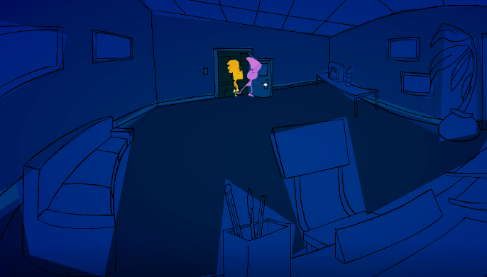
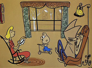
There's a good amount of animators on this site that are always doing cool new shit. First ones that come to mind are the Vadd Flatten twins, Hotdiggedydemon and Ukinojoe. Ignoring the videogame character jokes and focusing solely on the art and animation, they keep topping themselves. I think that's really cool and a great way to improve and I've been wanting to try and change things up more even if on a smaller scale. In this the caracter designs are really simple so it's easier to push the poses and try more stuff in terms of the character animation. Also there's those moving lines that they all have which I thought was cool. I also did backgrounds in a way that I've never done before. When I got to the one shot where Darnell walks out into the hallway after they break in and he's looking around all worried, I wanted to show a frontal view of Darnell coming out but also a frontal view of the doors at the end of the hallway and the only way I could think to do that was to bend the entire hallway. I didn't really know what I was doing but when I tried sketching it out it looked like this cool fish eye lens thing and I thought it was COOL. So I kept that but then I thought it would be weird if the whole cartoon was normal and then it got fisheye for that one shot so then I had to go back and give most of the backgrounds that effect. Again, I had no idea what I was doing so it was really hard but I think I got a believeable angle out of most of them. Then after I had finished all the backgrounds I learned that 4 point perspective is a thing and you can get a fish eye effect that way except it'll actually look right. I guess it's good because now I have another thing to try out and practice but it really would've been helpful if I knew about that earlier. So then I had all these cool looking backgrounds but I had no idea how I was gonna color them. I knew I wanted to do them all monochramatic but just one flat color wasn't doing it and I didn't have the time to pick a bunch of shades colors for every shape. I put in some placeholder colors and stopped thinking about it but then I learned about the UPA and how they changed the whole animation industry in the 50s with their flat style art and more abstract backgrounds. They basically invented that style of background where nothing's really colored inside the lines and it doesn't make any sense. I'm sure you know what I'm talking about it like every cartoon does it. Anyway I came back to the placeholder colors and saw the same kind of things starting to happen and I really like that style so I tried it and I think it's hey alright.
Good example of that style of backgrounds from Gerald McBoing Boing by UPA
Anyway I worked on it really hard and I didn't finish til 6am the day of Pico Day working all through the night and then I had to sit in a car with Emrox and his parents for 6 hours to go to the NG office which was a lot of fun, all of it. There were a lot of people there this year and I somehow had enough energy to actually talk to a lot of them. I don't konw if it's just me but every time I talk to someone in person who I already know on the interent, it's always really weird for the first couple minutes. This was my 3rd year going to the party and I thought that after this much experience I would've gotten over it but it seriously happens every time. It's those opening lines where you're comparing the image you had in your head to the image you're looking at, while simultaniously trying to think of something to say that isn't complete garbage but then you also reaize that you were just standing there silent this while time and you ' look like a huge asshole. It's all very strange. At least at first, after that its fine. Anyway it was a lot of fun and it gets better every year. If it happens again next year I'd definitely be up for coming back again. Also happy birthday Tom happy birthday Newgrounds hoorah hooray!


Fantastick
FUN FACT: PEOPLE ACTUALLY DRINK SHIT COFFEE.
Brewster
i wont believe it i wont